

WHY SOME SIGNS GET SEEN AND OTHERS GET IGNORED
Outdoor signage is everywhere. Yet only a few signs manage to interrupt the noise, stay in our memory, and make us look twice.
Walk through a busy market street and try something for a moment. Don't look for a particular shop. Just look around. There are signs everywhere. Names above doors, glowing letters on buildings, huge boards hanging over roads, small ones tucked between windows, and LED screens changing every few seconds. Some are expensive. Some are barely designed at all. And yet, after a minute, you will probably remember only one or two. That is the interesting part. We are surrounded by signs, but we don't actually notice most of them. Why?
The problem isn't visibility. It's attention.
A sign can be perfectly visible and still go unnoticed. You might be able to see a shop name from fifty meters away, but if it looks exactly like everything around it, your eyes have very little reason to stop there. Think about driving through a commercial area. You are watching the road, checking traffic, looking for an address, and noticing pedestrians, signals, vehicles, and buildings. At the same time, dozens of businesses are asking for your attention. Nobody has time to carefully read every sign. You glance. You recognize something. You move on. That small moment is where good outdoor signage has to do its work.
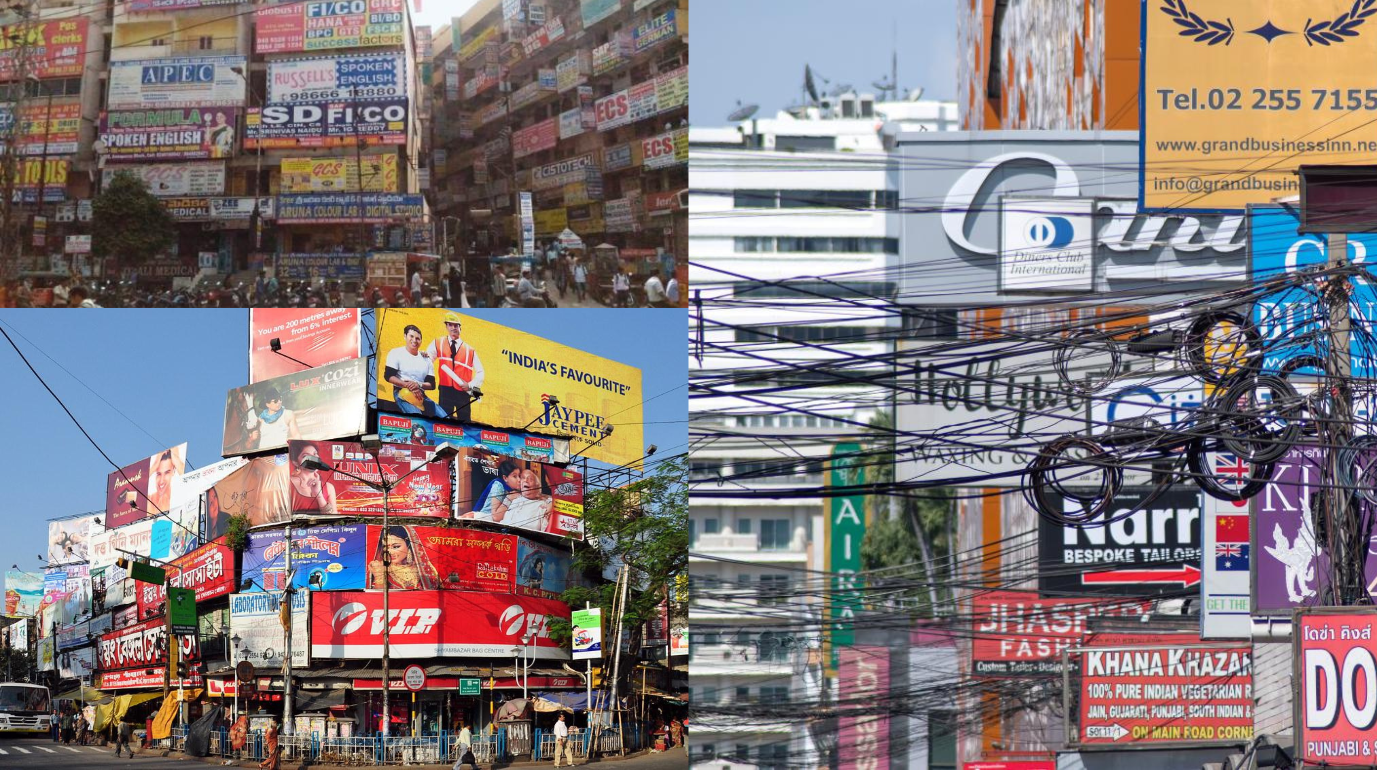
Some signs simply make it easier to look at them
There is no single trick behind a noticeable sign. Sometimes it is contrast. Sometimes it is the size of the lettering. Sometimes the shape of the logo catches your eye before you have even read the name. A well-lit sign can suddenly become much clearer after sunset. A little empty space around the letters can make the whole thing easier to understand. And sometimes, strangely enough, The sign gets noticed because it isn't trying too hard. Walk down a street where every business is using bright colors, giant lettering, and too much information. A quiet, well-proportioned sign can feel almost unusual. You notice it precisely because everything else is shouting. That is one of the less obvious lessons of outdoor signage: Being louder and being more noticeable are not always the same thing.
The eye doesn't read everything
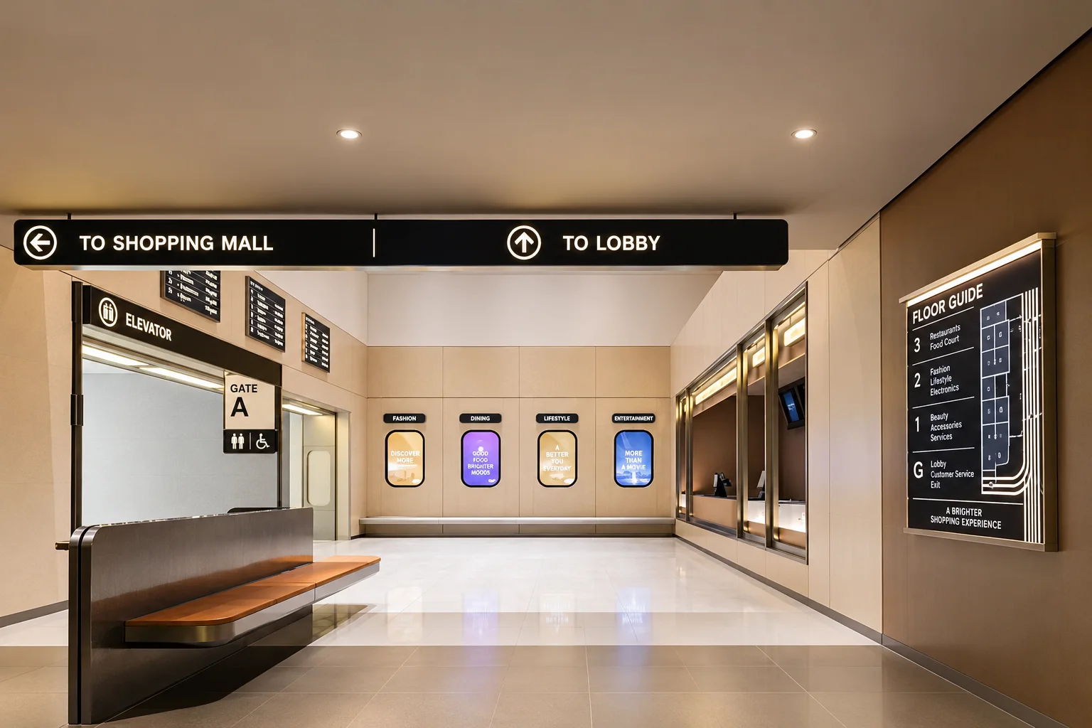
This is especially important when a sign is meant to be seen by someone passing in a car. There may be only a few seconds. The person isn't going to stop and read a paragraph about what the company does. They probably won't remember a phone number either. First, they need to recognize the business. A clear name. A familiar logo. A strong visual identity. Something that can be understood almost without effort. This is why typography matters so much in outdoor signage design. The letters aren't simply there to look attractive. They have to survive distance, movement, changing light, and everything else happening around them. A beautiful typeface that becomes difficult to read from the road isn't necessarily a beautiful solution. It is just a beautiful typeface in the wrong situation.
Then there is the problem of too much information
This happens often. A business has a large facade and thinks: We have space. Let's use it. So the sign gets a logo, company name, tagline, phone numbers, website, services, product categories, social media handles, and perhaps a few promotional messages. Nothing is technically wrong with any individual element. Together, however, they become difficult to absorb. A passer-by doesn't experience that sign as a list. They experience it as one visual object. If everything is important, nothing feels important. Good outdoor signage usually has a clear hierarchy. Your eyes should know where to go first, then second. The business name may be the first thing. The rest can wait.
A good sign also knows where it lives
This part is easy to miss when signage is discussed only as graphic design. A sign doesn't exist on a blank page. It sits on a building. The building has its own color, materials, windows, proportions, and lighting. The road has its own rhythm. There may be trees, neighboring businesses, traffic lights, and other signs around it. So a successful sign has to do two things at once: stand apart and belong. Too much similarity and it disappears. Too much contrast and it can look as though someone simply attached a board to the building without thinking about the architecture. This becomes especially important with facade signage and outdoor branding. When the signage, facade, elevation, lighting, and materials are considered together, the result feels less like an advertisement and more like a complete identity.
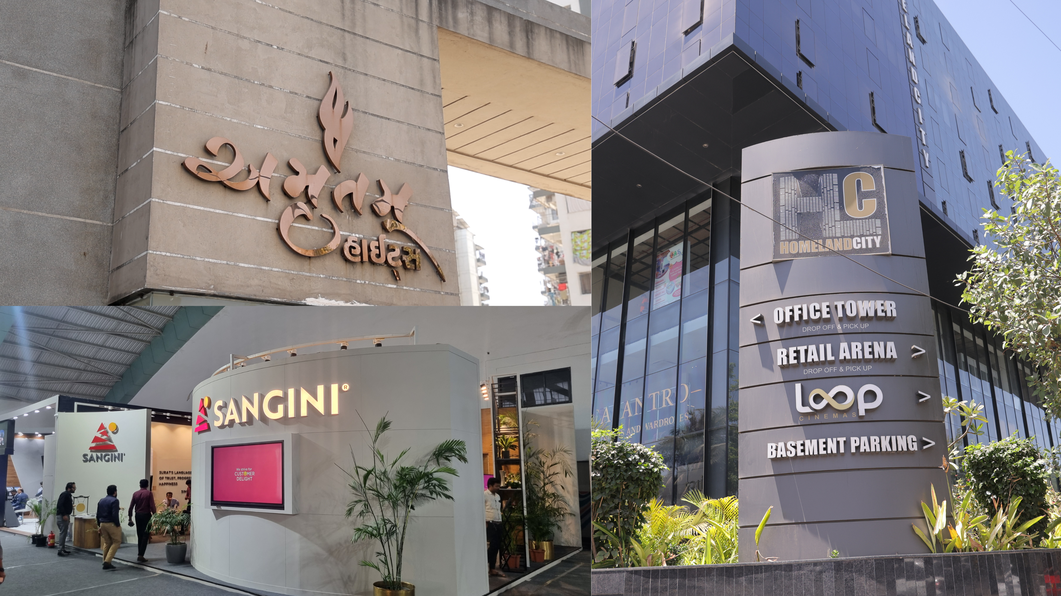
Night changes the sign
There is another reason two signs can behave very differently. The sun goes down. A facade that looked ordinary during the afternoon can suddenly become the brightest thing on the street. Letters that were difficult to distinguish earlier may become beautifully defined. On the other hand, poor illumination can create glare, wash out the letters, or make an otherwise good sign uncomfortable to look at. This is why illuminated outdoor signage needs to be considered as part of the design itself. Lighting shouldn't simply make a sign brighter. It should make the sign clearer. And there is a difference.

The signs we remember are usually more than signs
Think about a place you know well. You may not remember its exact address. You may not even know the street number. But you remember the building. The one with the big letters. The corner with that particular logo. The shop with the red facade. That is when signage becomes interesting. It stops being just a way of telling people where a business is and starts becoming part of how people remember where a place is. A sign can become a small landmark. Not every business needs to create one. But when the identity, architecture, visibility, and location come together properly, something like that can happen naturally. And once people begin using your sign to describe a place, you have achieved something advertising alone cannot easily buy. You have entered their memory.
So, what makes a sign noticeable?
There isn't a magic formula. It is usually a combination of things that seem quite ordinary on their own: good contrast, sensible scale, readable typography, appropriate lighting, clear hierarchy, thoughtful placement, and a design that understands its surroundings. But perhaps the most important thing is knowing what not to add. Because outdoor signage has very little time to make its point. A person passing by isn't waiting for an explanation. They are moving. And somewhere between the traffic, buildings, advertisements, and everything else competing for their attention, your sign gets one small opportunity. Not to say everything. Just enough to make them look. And, if you have done it really well, remember.

Planning signage of your own?
Get a quote→