
THE PERSON WHO DOESN’T WANT TO ASK
The quiet psychology of indoor signage – and how good spaces help us find our way without saying a word.
“It is far better to say too little than too much.”
Tom Geismar
 lovelyfasign.com
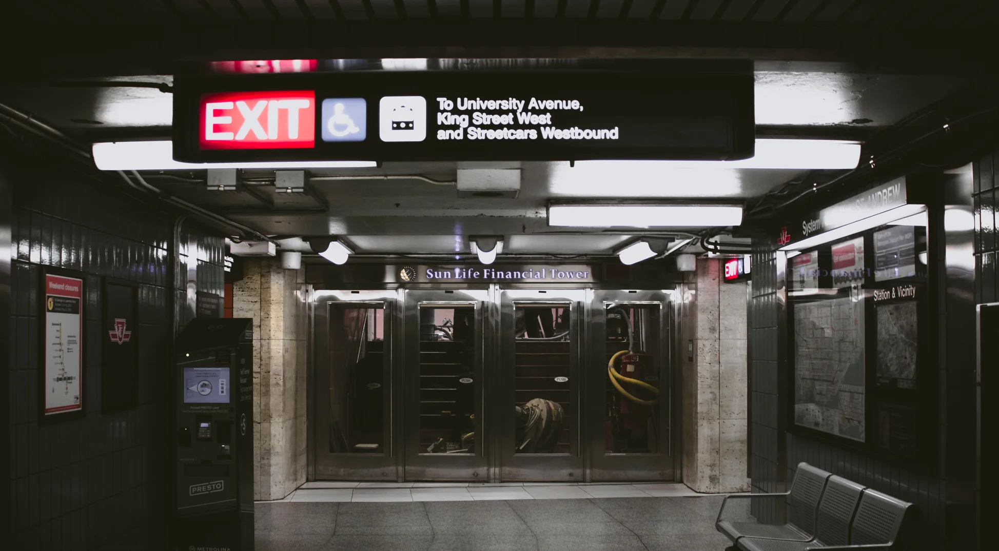
There is usually a moment. You walk into a building you have never visited before. Perhaps it is a hospital. Perhaps a corporate office. A hotel, a shopping mall, a school, or a residential tower. You know where you need to go. You just don't know how to get there. You walk a little farther. There is a reception desk somewhere behind you, but you don't want to go back. A corridor opens to the left. Another continues straight. There is a lift at the end. You look at the walls, then at the people moving around you, hoping that someone – or something – will make the decision for you. You don't want to ask. So you look for a sign. It is a very small human problem. But buildings are full of it. And strangely, we tend to notice indoor signage only when it fails.
The question a building should answer before you ask it
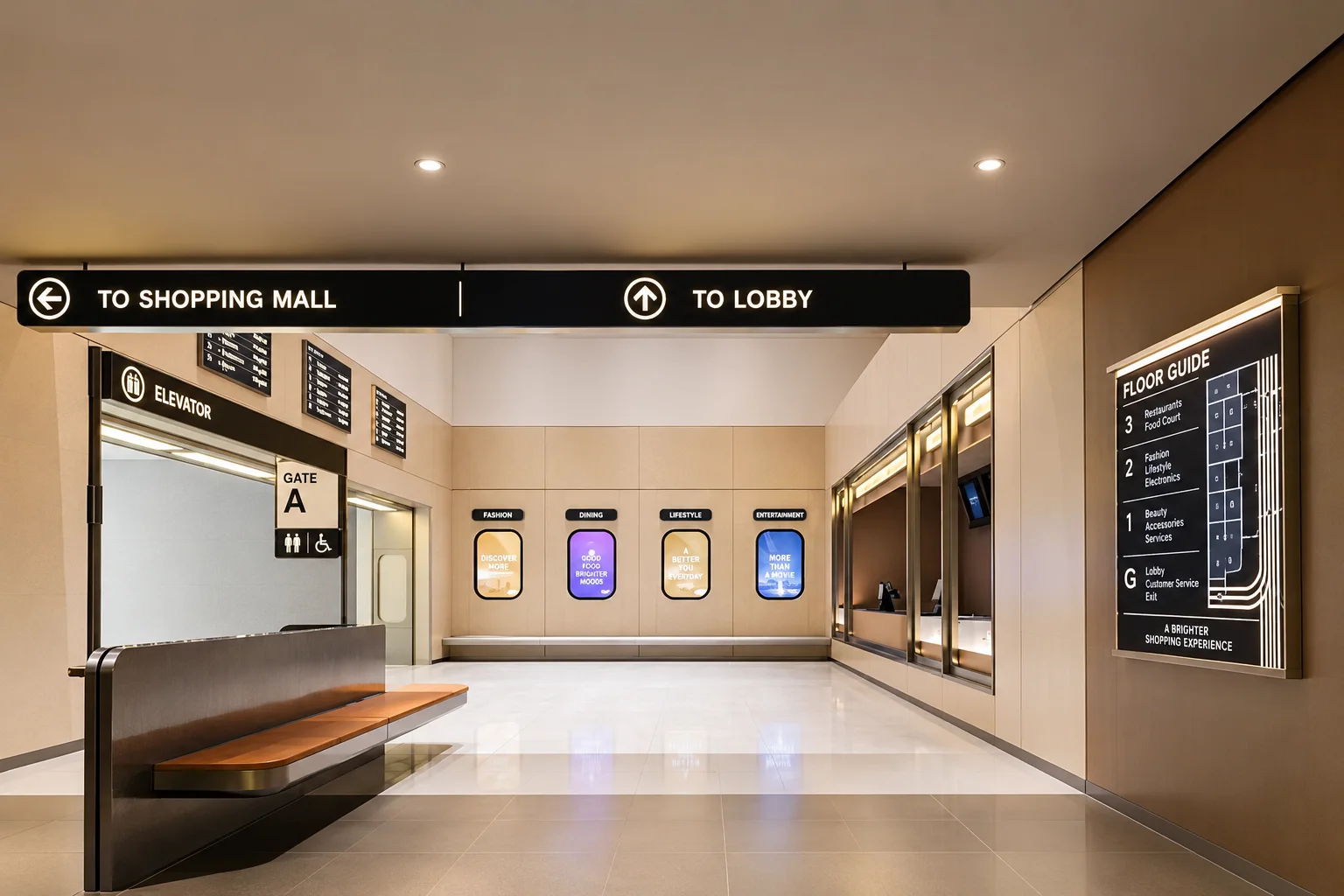
That distinction matters. A visitor entering an unfamiliar space is constantly making small decisions. Am I in the right place? Which way now? Is this the correct floor? Does this corridor lead there? How far is it? Have I missed it? This is the quiet work of wayfinding signage. A thoughtfully designed wayfinding system uses directional signs, maps, symbols, landmarks, room identification and visual hierarchy to reduce the mental effort involved in navigating an unfamiliar environment. A good system doesn't simply point somewhere; it gives a person confidence that they are making the right decision. This is why indoor signage solutions are more than boards attached to walls. They are a conversation.
 lovelyfasign.com
Ideally, it is a conversation that happens without words.
Imagine the same problem in a hospital
A hospital is perhaps the clearest place to understand what is at stake. Imagine arriving at a large hospital for the first time. You are already carrying a reason for being there. Maybe you are accompanying a parent. Maybe you are late for an appointment. Maybe you have been given a department name over the phone that you have never heard before. Inside, everything is moving. People are coming and going. Wheelchairs pass. Nurses hurry through corridors. Lift doors open and close. There are departments with unfamiliar names, several floors, waiting areas, laboratories and consultation rooms. Now imagine that the signs are inconsistent. One says radiology. Another says imaging. One arrow is blue. The next is green. A department number appears on one wall but not the next. You stop. Someone walking past notices your hesitation. You ask. That person points. You walk again. A few minutes later, you have to ask someone else. None of these moments feels dramatic enough to become a headline. But collectively, they create friction. This is where hospital indoor signage becomes more than a design exercise. Clear directional signage, room signage, floor identification, department signs and informational signage can help turn a complicated hospital into something a visitor can understand.
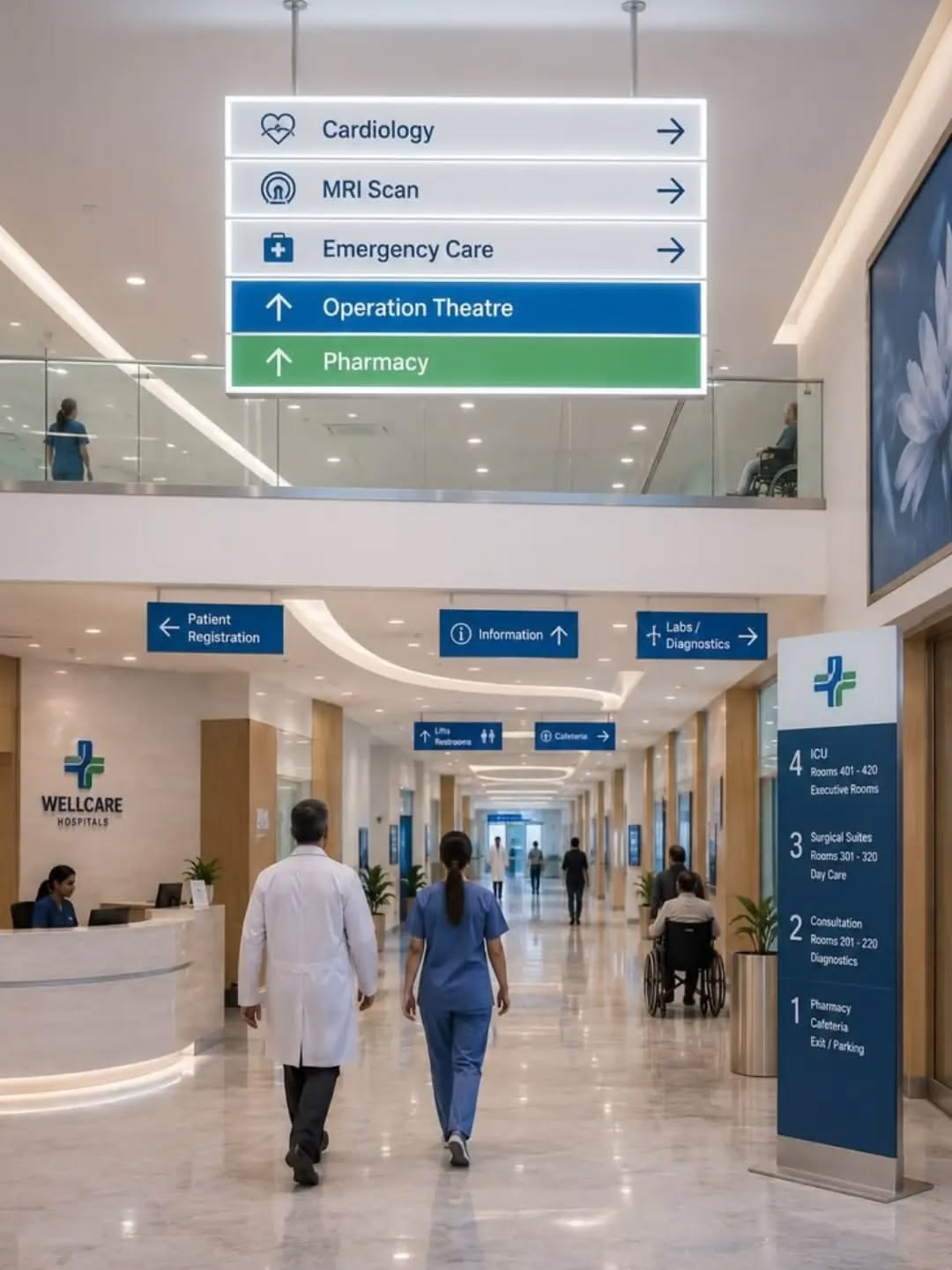
The same principle applies whether the project involves a small clinic or a large healthcare facility looking for indoor signage in Ahmedabad or elsewhere in Gujarat. The problem is universal: People should not need to become experts in a building simply to find their way through it. Good signage cannot change why someone has come to a hospital. But it can change what happens after they arrive. A clear departmental sign. A logical floor system. A recognisable colour. A directional arrow placed before – not after – the decision point. Small interventions. A considerably calmer journey.
Now leave the hospital and enter an office
The stakes change. The problem doesn't. Imagine arriving at a corporate office for a meeting. You are wearing the clothes you chose carefully that morning. You have the presentation open on your phone. You are perhaps five minutes early – which means you are trying very hard not to look lost. You enter the lobby. Reception is easy enough. Then comes the lift. Fourth floor. Left or right? You follow an arrow. Another corridor. Conference rooms A, B, and C. But where is yours?
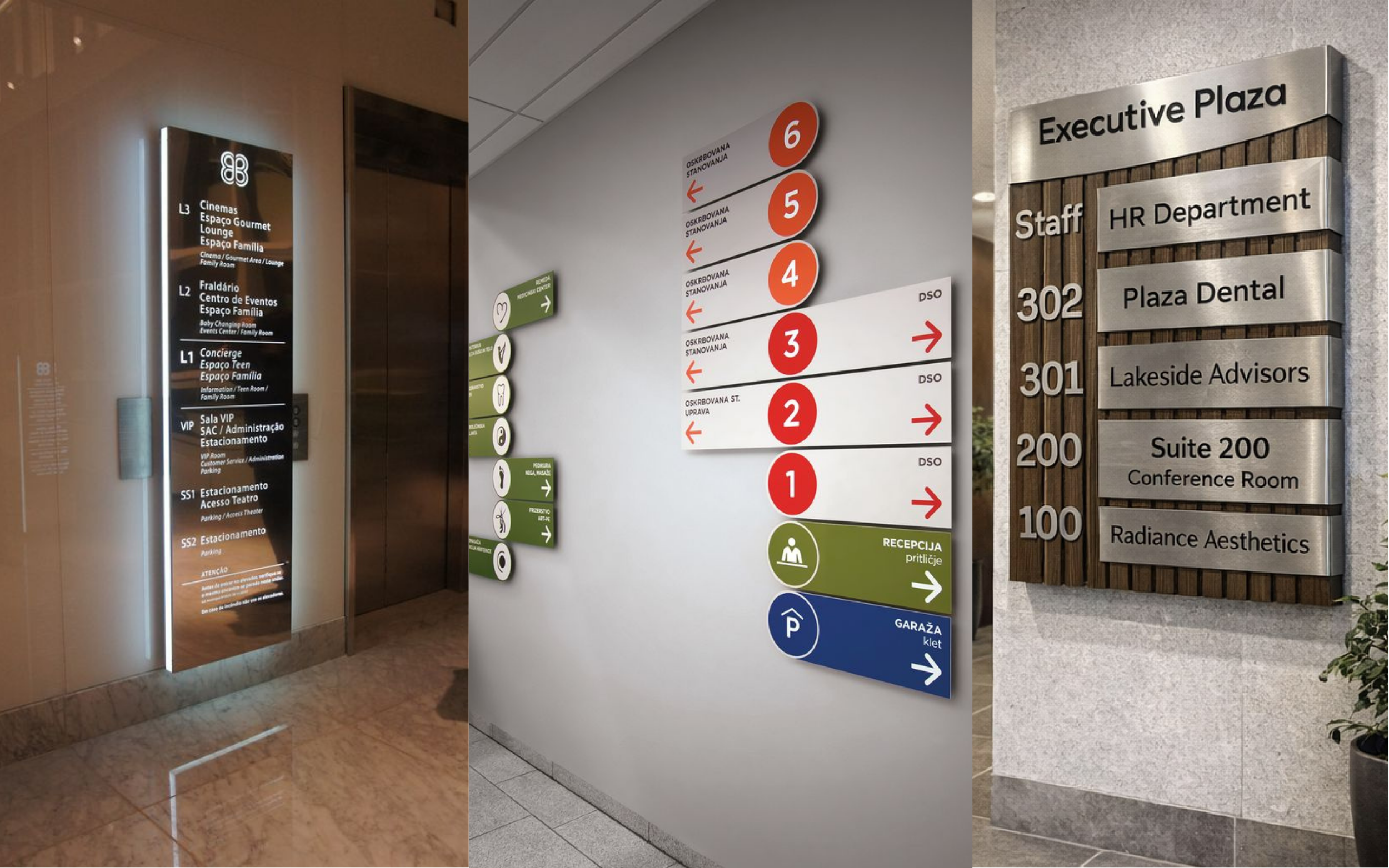
This is where office indoor signage quietly becomes part of a company's first impression. A visitor will probably never say, "The typography on your directional signage was excellent.” But they may leave thinking, *"This place feels organised." *Or the opposite. A building can have expensive furniture, beautiful architecture and a carefully designed logo – and still feel strangely uncertain if its visual information is inconsistent. The brand does not end at the reception desk. It continues down the corridor. A company's corporate office signage, reception signage, office door signage, meeting-room identification and lobby signage all become part of the same visual language. This is where indoor branding becomes more interesting than simply putting a logo on a wall. A well-designed indoor branding solution can carry the identity of a company through its reception, corridors, workspaces and meeting rooms. For an indoor signage company in India, the challenge should therefore be larger than manufacturing a sign. It should be understanding how that sign belongs to the environment around it.
Then there is the mall
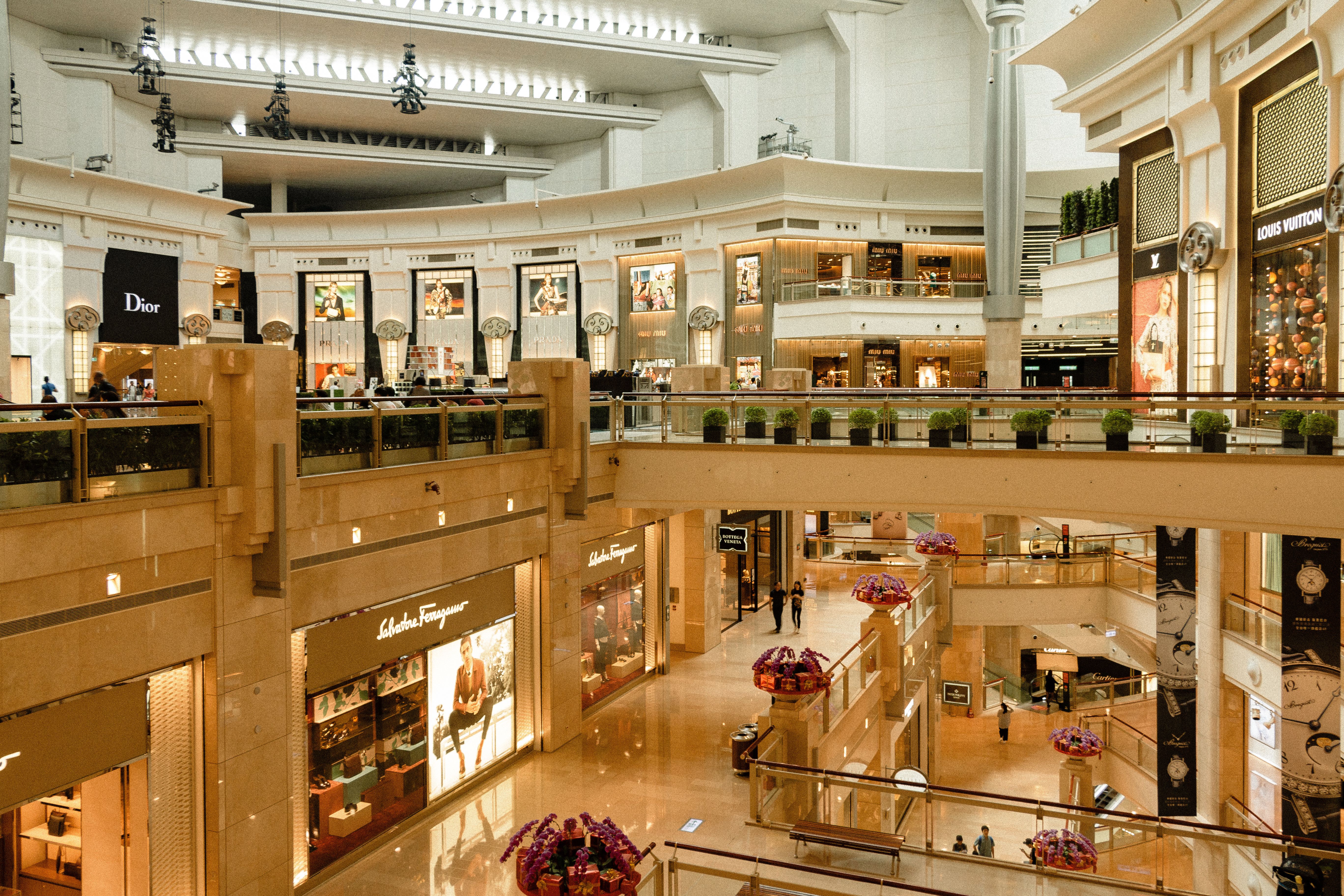
A shopping mall creates a different kind of confusion. Here, being lost is rarely an emergency. But it is still costly. You arrive looking for a particular store. You see a directory. You find the store name. Floor three. You take the escalator. Then the corridor divides. You look for another sign. Nothing. You keep walking. The store is somewhere nearby, but you cannot tell whether you are getting closer or farther away. The experience is subtle. You become irritated. You begin checking your phone. Perhaps you give up. Perhaps you never discover the restaurant at the far end of the floor. This is why retail indoor signage is not simply about placing a shop name above a door.
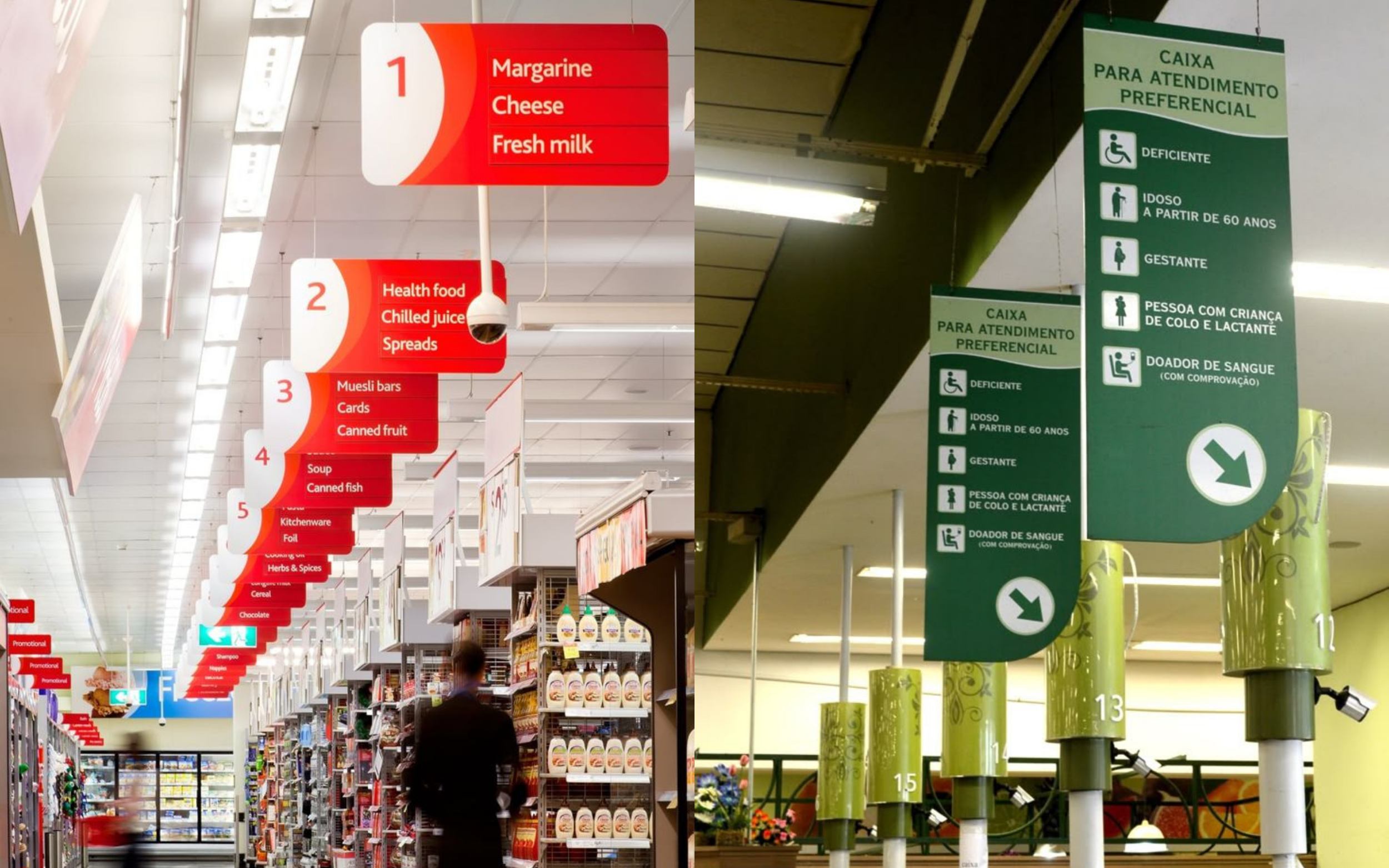
Shop indoor signage, directory systems, retail signage, navigation signage, promotional displays and point of sale signage all participate in the customer's movement through the space. A well-designed retail branding system can help a customer understand where they are, where they are going and what they might discover along the way. The same applies to a showroom. A visitor entering a premium automobile showroom, furniture showroom or fashion space is not merely entering a room filled with products. They are entering a carefully constructed experience.
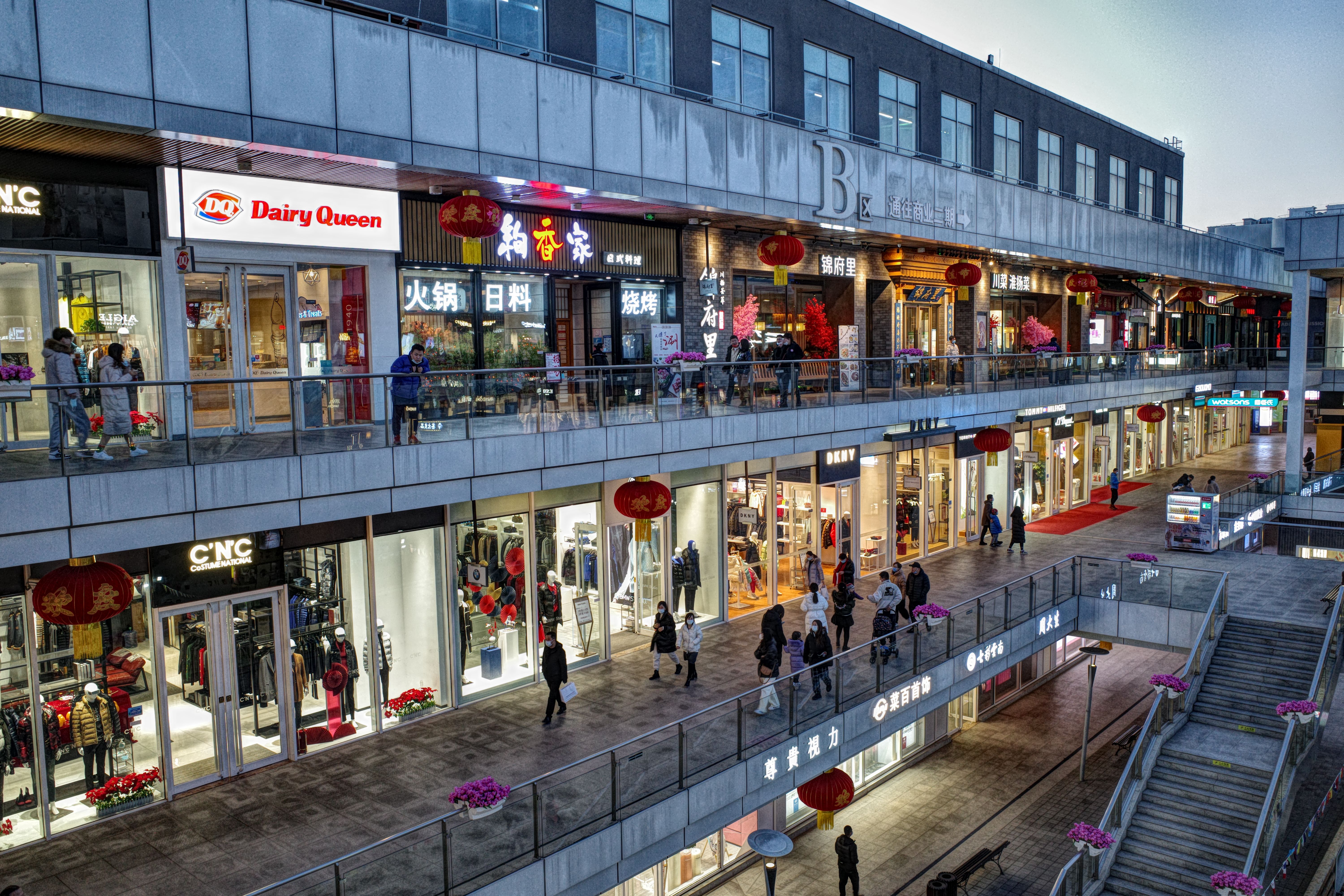
Showroom indoor signage and showroom branding should therefore feel like part of the architecture – not an object added after everything else has been designed. Outdoor advertising may win the first glance. Indoor signage has to win the next decision.
A residence has another kind of silence
 lovelyfasign.com
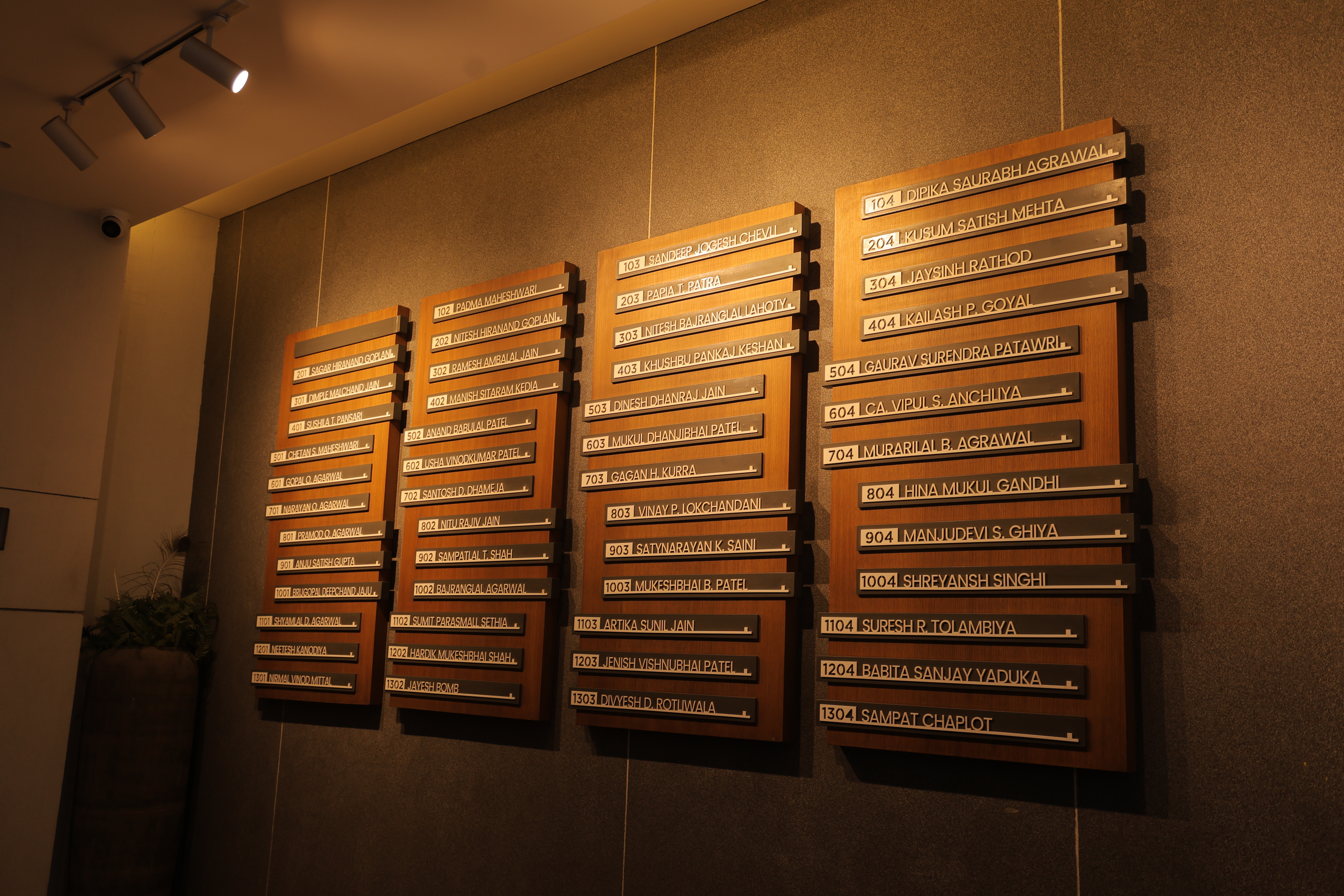
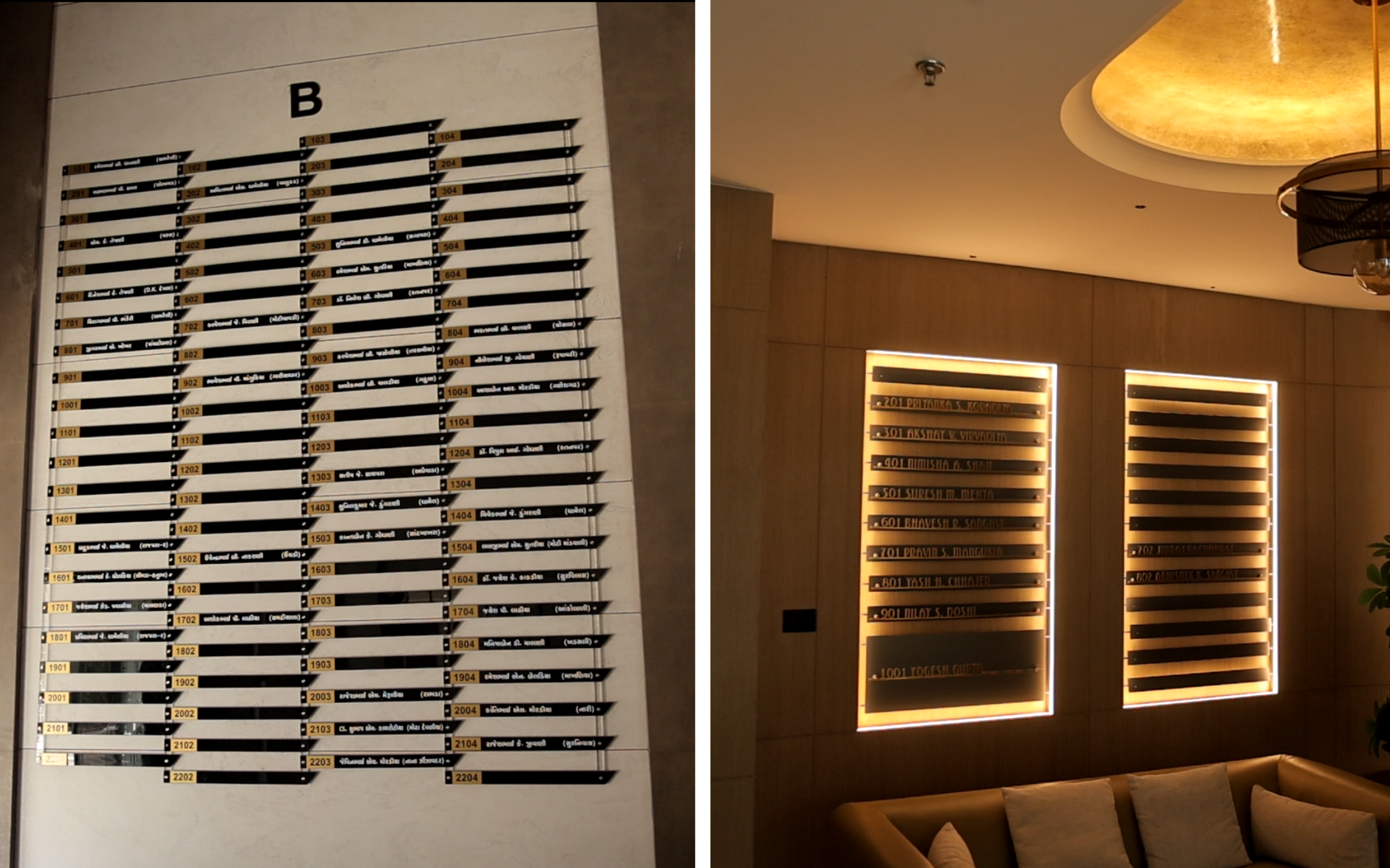
Now consider something more familiar. A residential tower. You enter the lobby for the first time. There are lifts, parking levels, amenities, blocks, towers and perhaps several entrances. You know the apartment number. But where is the tower? Which lift serves it? Where is the parking? Where is the clubhouse? Where does the corridor begin? Residential signage is rarely trying to persuade you. It is trying to make a place legible. And that word matters. A good residential environment should gradually become familiar. The signs become landmarks. The lobby becomes recognisable. The floor numbers begin to make sense. The route that once required thought eventually becomes automatic. You stop reading the signs. You simply know. That may be the highest compliment a wayfinding system can receive.
The strange success of signage nobody remembers
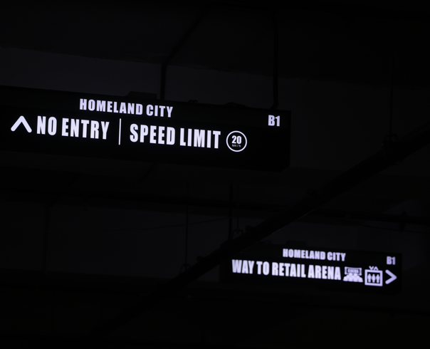
Think about the last time you walked through a well-organised airport, hotel, hospital or office. You probably don't remember every arrow you followed. You remember arriving. That is because effective wayfinding can become almost invisible. One review of indoor wayfinding research identifies spatial memory, floor-plan configuration, landmarks, signs and maps among the important elements people use to navigate complex interiors. The sign does not need to become the centre of attention. It needs to appear at the moment a decision is required. This is an important difference between visibility and usefulness. Outdoor signage often fights to be noticed. Indoor signage often has the opposite task. It must know when to speak. Too early, and the information is forgotten. Too late, and the visitor has already made the wrong turn. Too much information, and the sign becomes another problem to solve. Too little, and the person has to ask. The best sign seems to arrive at exactly the right moment.
The sign changes when the person changes
The same sign cannot solve every problem. A hospital visitor may be anxious. A corporate visitor may be nervous about being late. A hotel guest may be unfamiliar with the building. A shopper may simply be impatient. A resident may be carrying groceries. A first-time visitor may not understand the building's internal language at all. Good indoor signage begins with the person – not the board. That is why typography matters. Why contrast matters. Why symbols matter. Why consistency matters. Why language matters. Why placement matters. Why the distance from which a sign is first encountered matters. These details can appear almost insignificant when considered individually. Together, they determine whether a person walks confidently or stops and looks around.
 pexels.com
The person who didn't ask
Return to that person from the beginning. They are standing in the corridor. They look left. Then right. They notice a small sign. They follow the arrow. Another sign appears. Then a number. The corridor turns. There it is. The room. They walk in. Nobody knows they were lost. Nobody knows they were looking for help. Nobody had to stop what they were doing. The sign did its job, quietly. Perhaps that is the strange beauty of indoor signage. It does not always announce itself. It does not need to. It simply removes a small piece of uncertainty from someone's day. And if it is designed well enough, the person may never remember seeing it. They will only remember that they knew where to go. That is what a good indoor space should feel like. Not a maze. Not a conversation with a receptionist at every corner. Not a sequence of guesses. But a place that seems, somehow, to understand you. Because sometimes the best sign isn't the one that tells you where to go. It is the one that makes sure you never have to ask.

Planning signage of your own?
Get a quote→